Huma
- Scope
- Website
- Industry
- Consulting, B2B, Latam
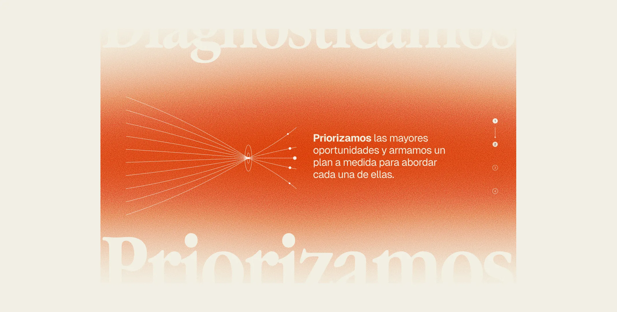
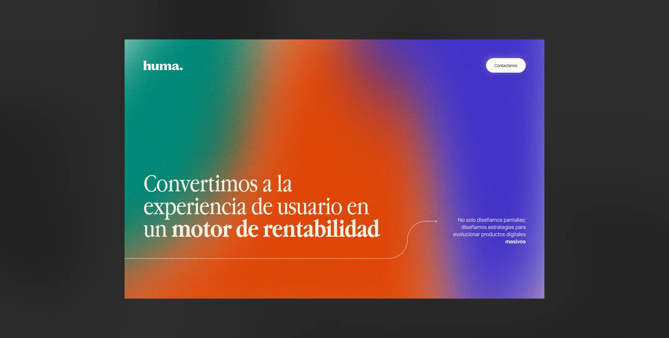
Huma needed a website and a brand strong enough to grow from it. So we inverted the usual order: we designed the website first, then extracted the elements that made the brand.
The rationale
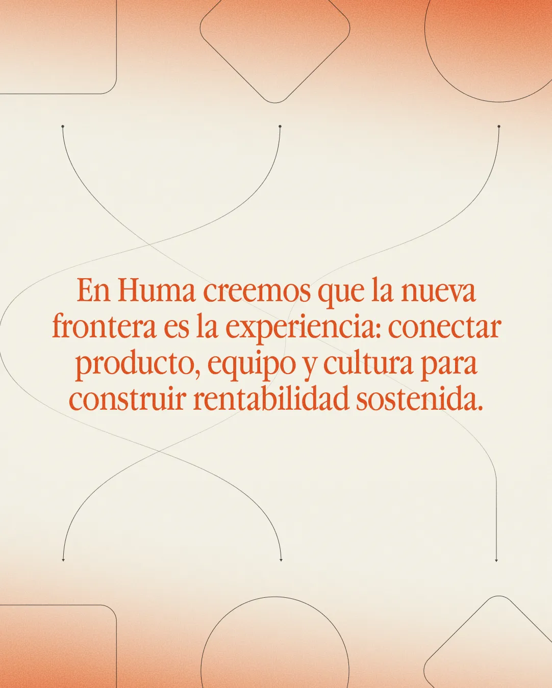
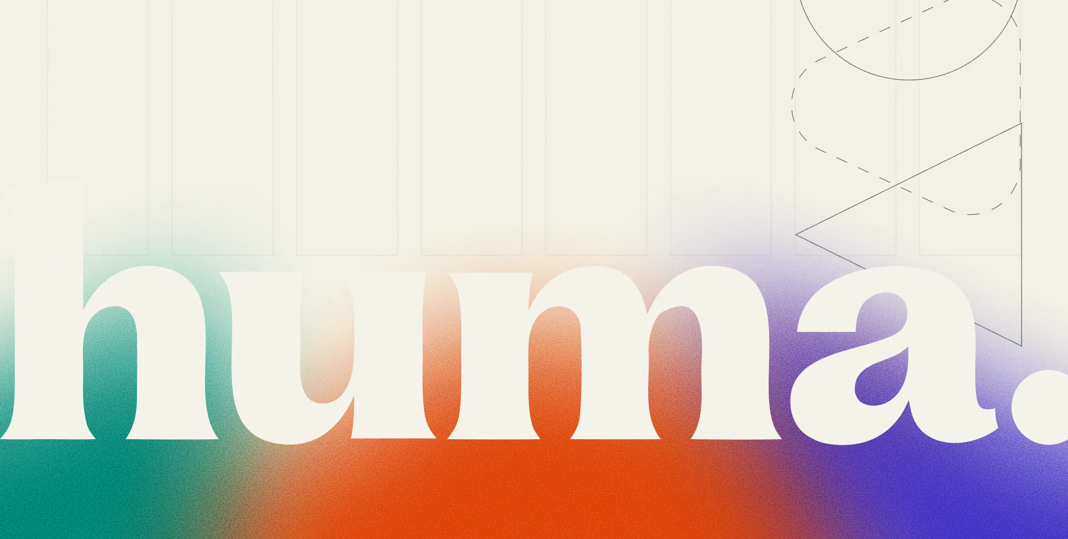
The concept came from crossing the name with the positioning. The name carries the Bauhaus idea of craft and technology amplifying each other, along with its human root. The positioning: practitioners for large teams. From that crossing came the whole system. A not-so-orthodox Bauhaus in the color palette and clear geometry. The human and the technological together in grid, gradients, texture and motion. The practitioner’s eye in editorial layouts and microinteractions. Nothing is arbitrary, every element traces back to one of those three ideas.